Bloom & Bowl
An editorial café website built to turn a simple breakfast menu into a distinctive hospitality brand
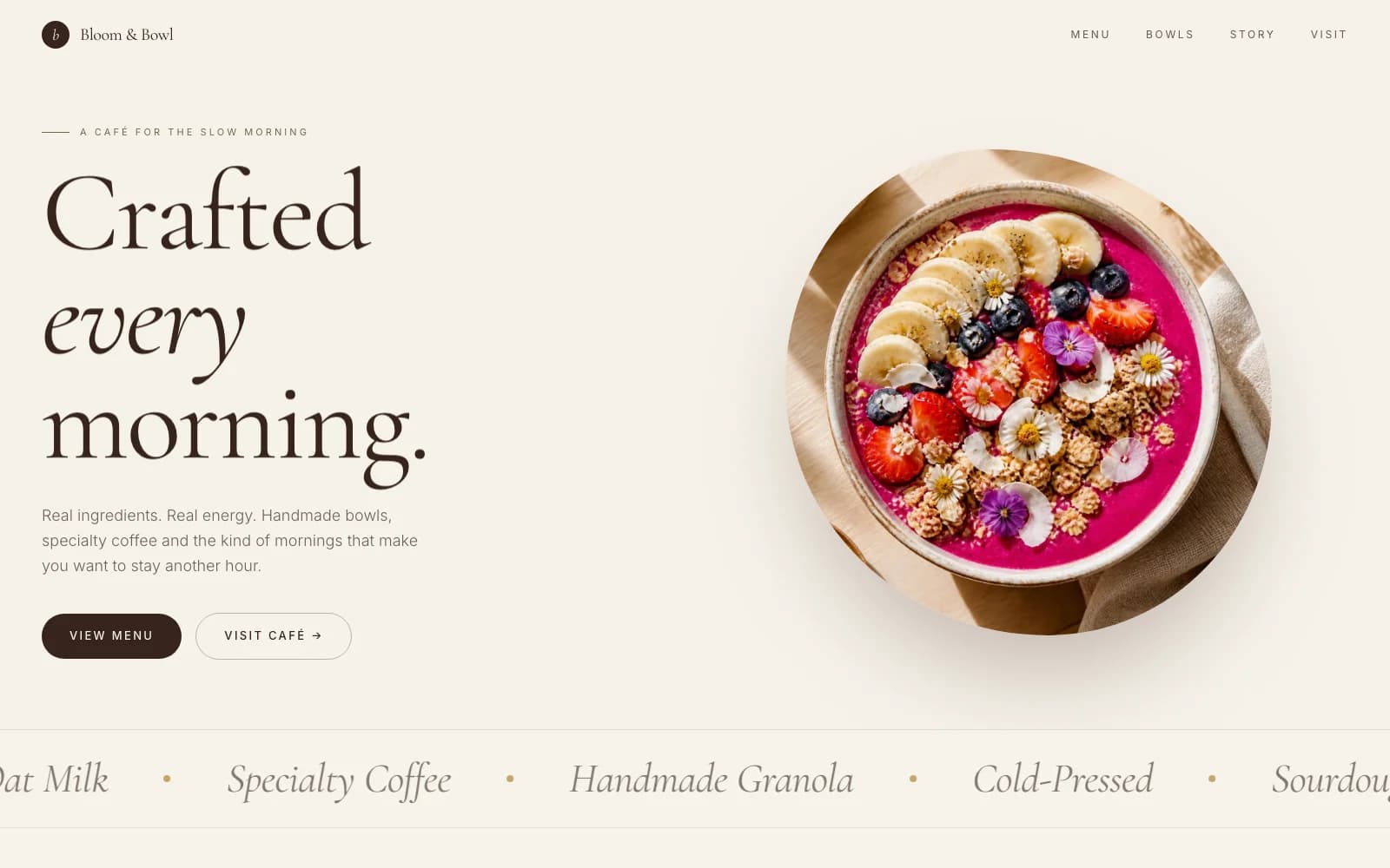
We designed and built the website for Bloom & Bowl, a Copenhagen café, so its handmade bowls and slow-morning philosophy come through before a visitor ever walks in.
Case Study — Restaurant & Café Website Design
Written by Ing. Hlib Yarovyi, Founder · Published
- Industry
- Restaurant & Hospitality
- Location
- Copenhagen, Denmark
- Concept
- Specialty coffee & breakfast bowls
- Timeline
- 3 weeks
- Stack
- Next.js · Tailwind CSS
The Brief
Bloom & Bowl is a café built around a short, strict list of rules: real ingredients, house-roasted beans, and no rushed mornings. That philosophy is easy to say over a counter and hard to translate onto a website without it reading like every other café site — a menu PDF and a map link.
The brief was to design a restaurant website that felt as considered as the food: warm, editorial, and unmistakably a café for people who care about ingredients, not a generic ordering page.
We built the site around the café's actual story and rotating signature bowls, using photography and typography to carry the brand rather than stock icons and a bullet-point menu.
The result is a café website that reads like a short magazine feature — a story, a philosophy, and a menu — rather than a directory listing.
The Challenges
A Simple Menu, a Crowded Category
Café and brunch websites are one of the most templated categories online. Standing out meant avoiding the default hero-photo-plus-menu-grid layout most competitors use.
Food Photography Has to Do the Selling
With no long sales copy to lean on, the bowls and interior photography needed to carry almost the entire persuasion job on their own.
Editorial Feel Without Slow Pages
Large, high-quality food photography and serif display type can easily make a site feel sluggish. The design had to stay light despite an image-led layout.
A Menu That Changes Seasonally
The café rotates its signature bowls seasonally, so the site's structure needed to present the current menu clearly without implying it's fixed forever.
What We Did
01
Led With Story, Not a Menu Grid
The homepage opens with the café's own words — why it exists, what it refuses to compromise on — before it ever shows a bowl, building trust the way a good in-person conversation with staff would.
02
Used Editorial Typography and Layout
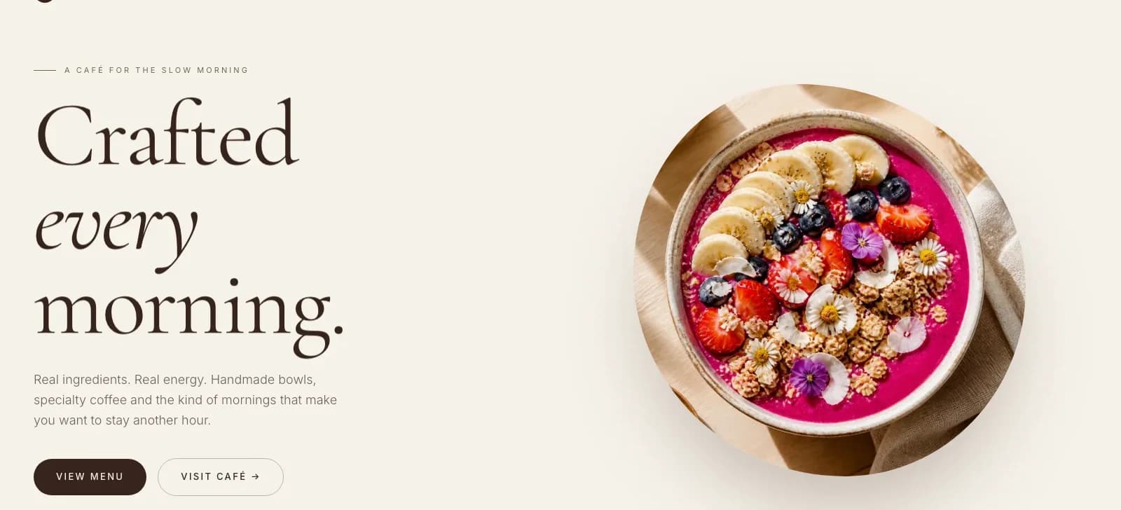
Serif display type, generous whitespace, and an asymmetric photo layout give the site a magazine-like feel that matches a slow-morning, craft-led brand instead of a fast-food ordering interface.
03
Structured the Menu as a Rotating Feature
Signature bowls are presented as a seasonal feature with a note that the lineup rotates, so the content stays accurate without needing a rebuild every season.
04
Optimized Food Photography for the Web
Every image was converted to WebP and served at responsive sizes through Next.js Image, so the editorial photography loads quickly instead of dragging the site down.
05
Built Clear Visit and Menu Actions
"View Menu" and "Visit Café" sit as the two primary actions on the homepage, keeping the path from browsing to visiting short and obvious.
Timeline: 3 Weeks
A focused, single-page-led build: one week for direction and copy, two weeks for design and development.
Week 1: Direction & Content
Brand tone, page structure, and story copywriting
Week 2: Design & Build
Editorial layout, photography treatment, and component build
Week 3: QA & Launch
Image optimization, cross-device checks, and go-live
Results
From brand direction to a fully live café website
Full brand story, philosophy, and rotating menu on a single focused homepage
Every photograph optimized and served responsively for fast mobile loading
Common Questions
- Yes. Bloom & Bowl leads with brand story and editorial photography instead of a generic hero-image-plus-menu-grid layout, which is what makes it stand out in a heavily templated category.
- We convert every image to WebP and serve responsive sizes through Next.js Image, so large food and interior photography doesn't slow the site down on mobile.
- Yes. We structured Bloom & Bowl's menu as a seasonal feature rather than a fixed list, so the café can update its signature bowls without needing structural changes to the site.
- Bloom & Bowl went from direction to launch in three weeks as a focused, single-page-led site. More complex hospitality sites with ordering or reservations take longer.
Need a Café or Restaurant Website That Feels Like Your Brand, Not a Template?
If you run a café, bakery, or small restaurant and need a site built around your actual story and menu, we can scope it with you.