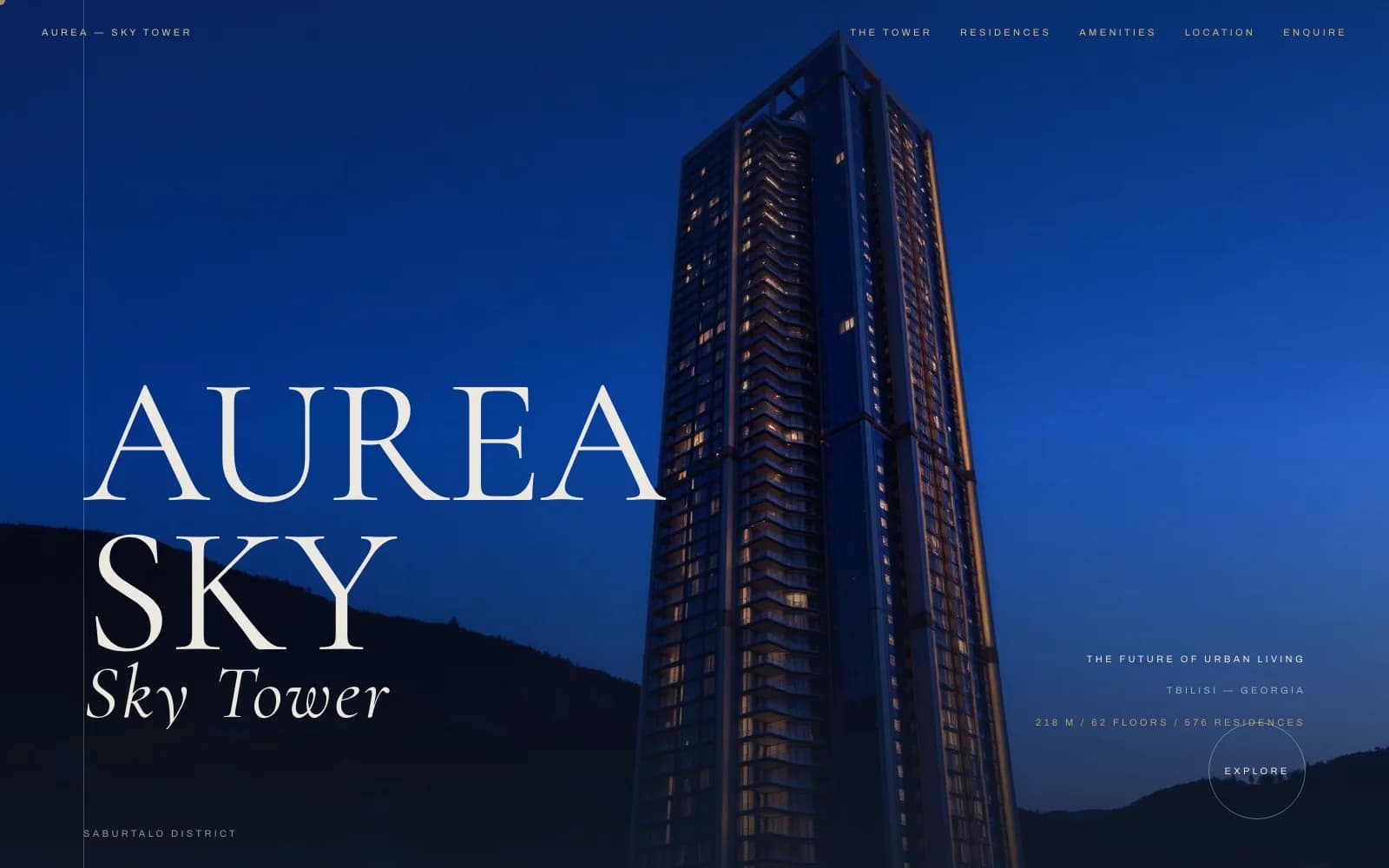
Aurea Sky Tower
A cinematic marketing website for a 62-floor luxury residential tower, built to sell units before the building tops out
We designed and built the digital sales platform for Aurea Sky Tower, a 576-residence landmark in Tbilisi, translating an architectural pitch into a website that qualifies serious buyers.
Case Study — Real Estate & Property Development Website
Written by Ing. Hlib Yarovyi, Founder · Published
- Industry
- Real Estate & Property Development
- Location
- Tbilisi, Georgia
- Property
- 62 floors · 576 residences
- Timeline
- 6 weeks
- Stack
- Next.js · GSAP · Tailwind CSS
The Brief
Aurea Sky Tower is a 218-meter, 62-floor residential development in Tbilisi's Saburtalo district. Before a single apartment could be sold off-plan, the developer needed a digital presence that matched the ambition of the building itself — something a luxury real estate buyer would trust with a seven-figure reservation.
A property development website like this has to do two things that pull in opposite directions. It has to feel like a design statement, because buyers judge a tower's quality by the polish of everything around it, including the website. And it has to convert, because the entire point of the site is to turn traffic into qualified enquiries for residences, floor plans, and amenities.
The brief was to build a real estate marketing site organized around the way high-end buyers actually shop: the tower's story, the residences on offer, the amenities that justify the price per square meter, the location within the city, and a direct path to enquire.
We delivered a five-section website — Tower, Residences, Amenities, Location, Enquire — with cinematic scroll-driven motion that reads as premium real estate marketing, not a template.
The Challenges
Selling a Building That Doesn't Exist Yet
Off-plan real estate has no finished interiors to photograph. The site had to sell scale, views, and lifestyle using renders, architectural facts, and art direction instead of real photography of finished units.
Luxury Expectations, Real Budget
Buyers at this price point compare the site instantly against international developer sites. The design had to hit that bar without the budget of a global studio.
Motion Without Slowing the Site Down
A property site this cinematic leans on scroll-driven animation and full-bleed tower photography. Both had to be built carefully so the site still loaded fast on mobile, where many first visits happen.
One Page, Many Buyer Questions
Serious buyers want floor size, floor count, unit mix, and location context before they will fill out a form. All of that had to live on the site without turning it into a wall of text.
What We Did
01
Structured the Site Around the Buyer Journey
We organized the site into Tower, Residences, Amenities, Location, and Enquire — the same sequence a serious buyer works through before requesting a call, rather than a generic homepage-plus-pages structure.
02
Built Cinematic Scroll Motion
Using GSAP-driven scroll animation, the tower imagery, headline typography, and key stats (218m, 62 floors, 576 residences) reveal in sequence as the visitor scrolls, giving the site a pace closer to a short film than a brochure.
03
Designed a Restrained, Editorial Look
Dark cinematic tones, serif display type, and generous negative space carry the luxury positioning, keeping the interface out of the way of the tower photography and the numbers that matter to buyers.
04
Kept the Enquiry Path Short
Every section links back to a single, clear enquiry action, so a buyer who is convinced by the Amenities section is never more than one click from starting a conversation.
05
Optimized for Mobile-First Browsing
Since many first touches on a real estate listing happen on a phone shared through a link, we built and tested the scroll experience mobile-first, not as an afterthought to a desktop design.
Timeline: 6 Weeks
The project moved from architectural brief to a launch-ready sales site in six weeks, sequenced around content first, then motion.
Weeks 1-2: Direction & Structure
Defined the five-section buyer journey, sourced and prepared tower renders, and locked the cinematic visual direction
Weeks 3-4: Build & Motion
Built the Next.js site and layered in GSAP scroll-driven reveals for hero, stats, and section transitions
Weeks 5-6: Performance & Launch
Tuned image loading for the render-heavy pages, tested across devices, and went live
Results
Buyer-journey sections covering Tower, Residences, Amenities, Location, and Enquire
Floors represented with dedicated stats, imagery, and scroll-driven storytelling
From architectural brief to a launch-ready property sales website
Common Questions
- Yes. Aurea Sky Tower sold from renders and architectural specifications, not finished-unit photography. We build the visual and content strategy around what a pre-construction or off-plan property actually has available.
- We put the budget into a small number of decisions that carry the whole site — typography, motion, and the sequence of sections — rather than spreading it across many pages. That is how Aurea Sky Tower reads as premium without a global agency budget.
- It can, if the motion is built deliberately. We use GSAP scroll triggers tied to real content rather than heavy video, and we optimize every render and photograph for the viewport it's shown on.
- At minimum: a clear location and building story, unit and amenity details, and a short path to enquiry. Aurea Sky Tower structures all three around a single scroll-driven narrative instead of separate, disconnected pages.
Need a Real Estate Website That Sells Before the Building Is Finished?
If you're marketing a residential tower, development, or off-plan property and need a site that matches the price point, we can scope it with you.