If you're searching for a website for an education or study-abroad agency, the visitors you actually want are not browsing casually. They're researching a specific decision, often against a deadline, often stressed, and often for a child rather than themselves. That changes what the site needs to do compared to most service businesses.
We built exactly this kind of site for Osvita Poland, an education consultancy that helps Ukrainian students apply to Polish universities. The brief was to turn a genuinely complicated admissions process, document apostilles, university selection, scholarship eligibility, wartime tuition-free options, into something a stressed parent could understand in under a minute and act on immediately.
What This Kind of Website Actually Needs to Do
Answer the Anxiety Before Asking for the Form
Education and study-abroad decisions carry real financial and personal weight, and the audience is usually researching under pressure: application windows, scholarship cutoffs, or a visa deadline. Website credibility research backs up how quickly that judgment happens: visitors judge a business's credibility from its website design in as little as 0.2 to 2.6 seconds, long before they read a word of copy.
For a younger audience specifically, that judgment leans heavily on social proof. 87% of 18-24 year-olds say they're influenced by online reviews, and a similar share trust reviews as much as a personal recommendation. A site that skips proof points and jumps straight to a sales pitch loses exactly the audience it needs most.
Reduce a Complex Process to a Visible Sequence
Nobody wants to read three paragraphs to understand what happens after they submit a form. The site's job is to compress a genuinely multi-step process, document prep, university shortlisting, submission, acceptance, into a sequence a stressed visitor can absorb in seconds, without hiding any of the real steps involved.
Get the Contact Path in Front of Someone Who's Already Convinced
A visitor who arrives already leaning toward booking a consultation should never have to hunt for how. Every screen of a high-intent education or admissions site should assume some visitors are ready to act now.
Case Study: Osvita Poland, Ukraine-to-Poland University Admissions
The Brief
Osvita Poland helps Ukrainian students and families navigate university admissions in Poland, a process involving document translation, apostilles, university selection, scholarship eligibility, and, since the war, tuition-free options at state universities for Ukrainian applicants. That's a lot for a family to absorb on a first visit, especially one searching in a moment of stress.
The market context makes the stakes higher than they might first appear. Ukrainian student enrollment in Polish universities fell from roughly 48,100 in the 2022-23 academic year to about 19,900 in 2023-24, and in April 2025 Poland tightened its student visa system, introducing a cap of 50% international students at any given university along with stricter language-proficiency and enrollment-status requirements. Fewer spots and stricter rules mean applicants need clearer, more current guidance, not less, which is exactly the gap a well-structured admissions site is built to close.
The Structure That Actually Converts
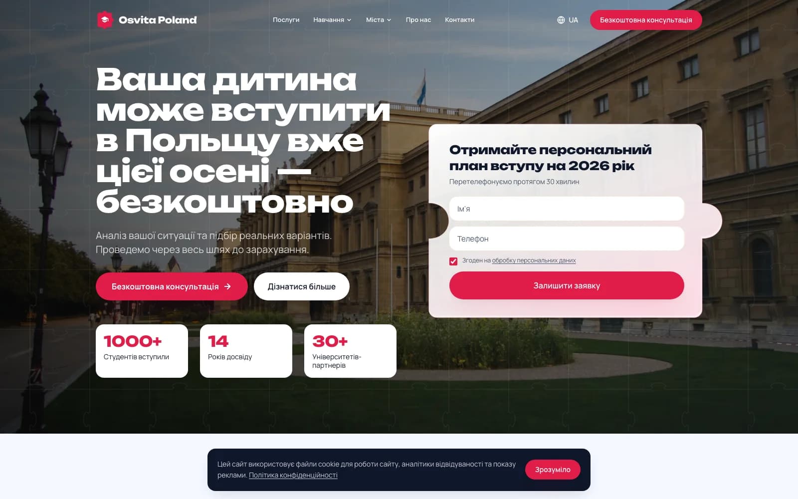
Rather than a generic "contact us" education site, we built the homepage around the exact anxieties a parent or student has, cost, timeline, degree recognition, and what happens if paperwork goes wrong, and answered each one before asking for a form submission. A persistent "get your personal admissions plan" form sits above the fold alongside the hero content, so a visitor who is already convinced never has to scroll to act.
The entire admissions journey, situation review, university shortlist, document preparation, submission, and post-acceptance support, is broken into five plain steps, replacing vague reassurance with a visible process. Tuition cost, EU-wide degree recognition, and university partner count are presented as short stat blocks a stressed visitor can absorb in seconds rather than paragraphs they have to dig through. Because the primary audience researches on mobile, often in Ukrainian, the interface was built language-first and mobile-first from the start rather than adapted from a desktop, English-first template.
The Result
The project moved from admissions-process mapping to a live lead-generation site in four weeks: week one mapped the five-step journey and wrote outcome-first copy for a stressed, time-sensitive audience, weeks two and three built the consultation-first layout and proof-point sections, and week four covered form testing, mobile and language QA, and launch. You can see the full breakdown in the Osvita Poland case study.
What to Include on an Education or Study-Abroad Website
- An outcome-first headline. Speak to the goal, a child starting university this year, before explaining the mechanics behind it.
- A persistent, above-the-fold consultation form. Visitors who are already convinced should never need to scroll or hunt for how to act.
- A visible, numbered process. Five or six plain steps beat a paragraph of reassurance, especially for a first-time applicant trying to understand what they're signing up for.
- Scannable proof points. Cost, timeline, and recognition of the qualification, presented as short stat blocks, not buried in body copy.
- Language- and device-matched design. If your real audience researches on mobile in a specific language, design for that from the first wireframe, not as a translation layer added at the end.
- Accurate, time-bound policy language. Where a benefit like a tuition waiver or visa allowance is real but time-limited or conditional, state it precisely. Overstating it creates a trust problem the moment a visitor checks with the actual institution.
Common Mistakes Education and Admissions Websites Make
The most common failure is leading with the institution's process instead of the applicant's outcome, walls of copy about "our methodology" before ever addressing what the visitor actually came to find out: cost, timeline, and whether this is realistic for them.
The second is treating the contact form as an afterthought at the bottom of a long page, when the highest-intent visitors, the ones already leaning toward booking, are the ones most likely to leave if the next step isn't obvious immediately.
The third is a desktop-first build for an audience that actually researches on a phone, often in a specific language that the main template wasn't designed around.
How Long It Takes and What It Costs
A focused, single-service admissions site can realistically go from brief to launch in about four weeks when the process steps, proof points, and copy are agreed upfront, the same timeline as Osvita Poland. Sites covering multiple countries, programs, or more complex application paths take longer to scope properly. Cost follows the same logic: it tracks the number of distinct journeys, languages, and proof points the site needs to carry, not a flat per-page rate.
Ready to Build Yours?
If you run an admissions consultancy, language school, or study-abroad service and need a site that turns research into booked calls instead of just informing visitors, we can scope it with you. See more of our portfolio, explore our website services, or get in touch to talk through your project.